Huawei Honor 6 Review
by Andrei Frumusanu & Joshua Ho on September 12, 2014 9:00 AM EST- Posted in
- Smartphones
- Huawei
- Android
- Mobile
- Honor 6
Like almost every other OEM out there, Huawei differentiates its Android implementation through a custom skin and framework - called EmotionUI. The Honor 6 comes with version 2.3 and that is the one I'll be reviewing. Again I'd like to mention that this variant came with a lot of pre-installed Chinese vendorware that may not be included in the international version of the phone. Thankfully, Huawei more or less managed to separate (willfully or not) the obvious core parts of the software experience from the added parts that may be Chinese exclusives.
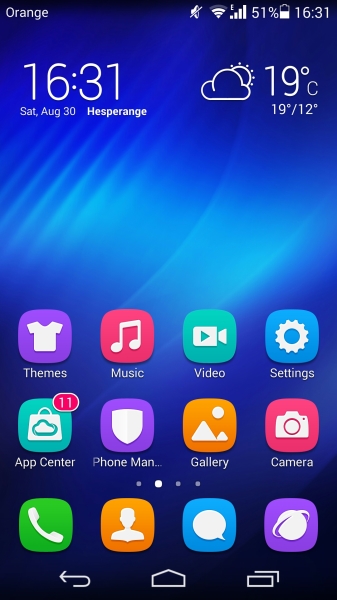
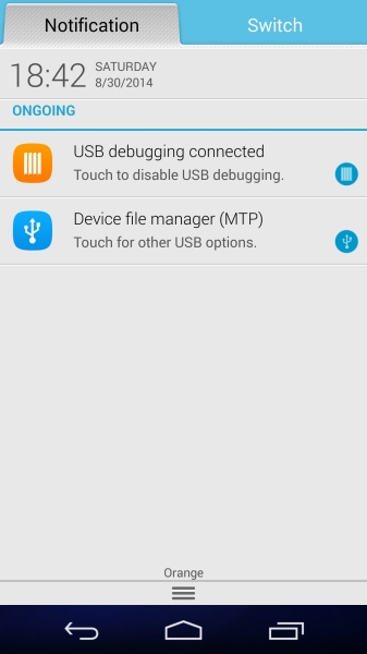
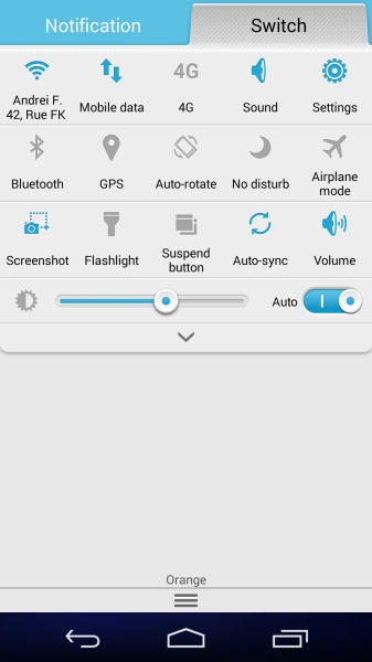
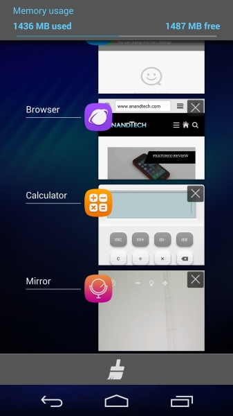
The design of the default UI theme employs a simplistic yet accentuated approach. The various elements remind of a mash between pre-iOS 7 with modern Android. There is a general emphasis on blue accents. Functionally, Huawei has kept it simple and has not veered off from standard Android too much. The notification shade is separated into the actual notification area and the switch toggle panel. Unlike some OEMs the notification area is clean and all additional toggles controls were added to the dedicated switch panel, which I find a better alternative than the implementations of other vendors while still adding value to stock Android.
One thing that I found endlessly infuriating is that if you do swipe right to, or use two fingers to pull down the switch panel down, it would remain in that view until you swiped/tap it back left to the notification view even if you have dismissed and pulled down the notification panel again with just one finger. A very odd inconsistency that was hard to get used to when quickly trying to view one's notifications.
The biggest differentiator to stock Android is probably the home launcher: it lacks an application drawer and thus makes the home screens themselves the application drawer as in iOS. I found myself endlessly creating folders and trying to manage the application icons on the home screen to keep it in a somewhat reasonable order and cleanliness. Of course there is nothing preventing one from installling a custom launcher replacing Huawei's. The stock launcher offers little reason as to why one should keep it as it offers little added functionality. In a sense, it's a plus for simplicity's sake but can quickly get overwhelming when you start installing a lot of apps which you don't regularly use.
What most people will notice is that use of rounded square background for any and all application icons throughout the OS. This is unfortunately an aspect you will like, hate or simply feel indifferent about, but cannot be changed. The system tries to generate a fitting background to an application's icon - most times it work, but sometimes it fails and this results in an odd look where the original icon seems cut off and plastered on top.
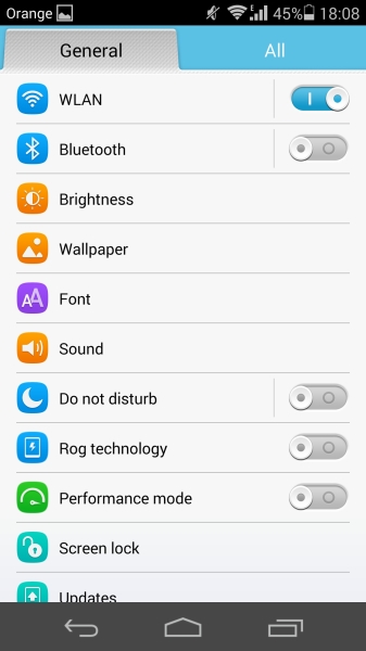
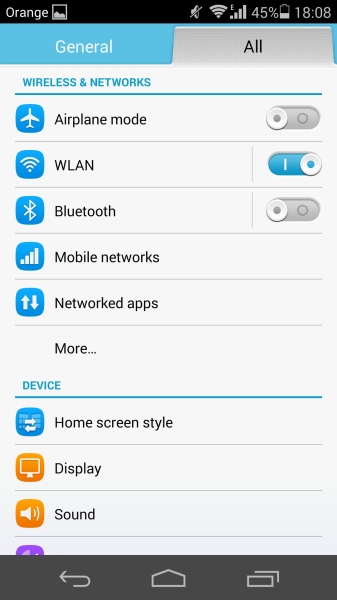
The settings screen offers a simplified view with the most accessed items on a single page view. If you want to delve a bit deeper the complete settings page is available at a swipe. The categories are clean and well ordered. I don't have too much too say about it as it's pretty much what you expect from a well-implemented settings screen.
Here's where usually most OEM user interfaces stop their customization of the core aspects of the Android framework stop. But here's where it gets really interesting. On the main home screen is a shortcut to the so-called "Phone Manager", which is also accessible via the settings screen in its own category.
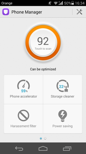
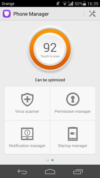
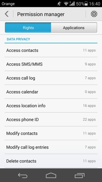
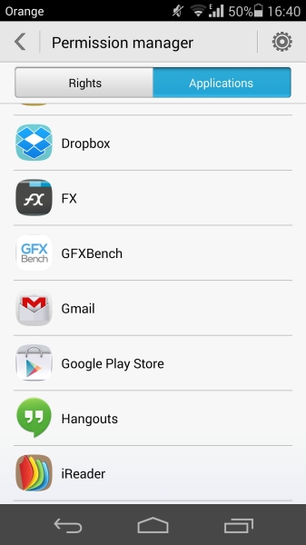
Here you can find various dubious options such as "Phone accelerator", "Storage cleaner" or even a built-in virus scanner. There's nothing too interesting in most of them, with the phone accelerator being nothing else than an active task manager for clearing memory. For the other items however what we find is the most extensive application permission manager I have seen ship on any Android device to date.
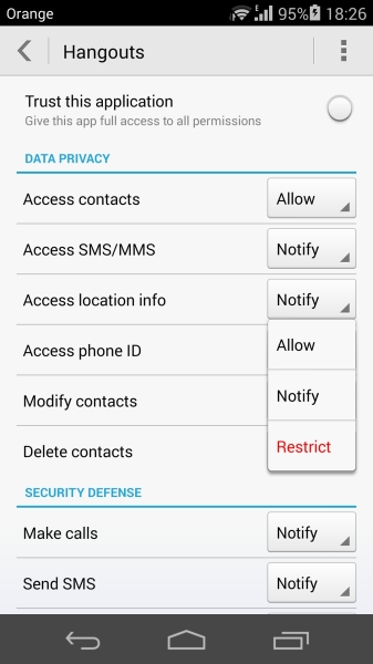
By default, any time you install an application on the device you would get prompted the usual permission acknowledgement dialog with a list of permissions that the developers feel they need to access. Huawei has built a framework on top of that extending that permission management. With the the built-in permission manager you are able to fully control apps on a per-permission basis and decide whether to grant, revoke, or always prompt for whenever an application requests a function needing a specific permission.
This is what Google already promises to deliver with Android L, but what seems to me that it goes one step further by allowing you detailed management any time you wish, instead of just runtime prompting (Google has yet to finalize L so this may be subject to change).
A much-needed feature on Android that Huawei provides is both the notification manager and the startup manager: it allows a centralized settings screen that controls what applications are allowed to push notifications onto the notification shade, and similarly to that, which applications are allowed to be launched at boot. These are a boon for fighting adware and annoying applications which like to clutter and needlessly bloat the phone.
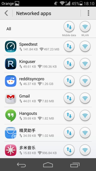
The framework also provides fine-grained network connectivity permissions, allowing one to manage which apps are able to access the cellular or Wi-Fi networks while offering a clean view of each app's data usage.
Needless to say, Huawei has really impressed me with what they've provided in terms of rights management in EmotionUI. It can be easily be viewed as the new high standard which other OEMs, and hopefully Google too, should strive to achieve in all their future Android phones.
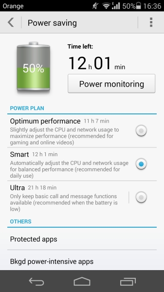
The power controls are also a interesting feature on the phone. We have a standard performance profiles that we might find on some phones. The real difference between the "Smart" and "Optimum Performance" settings is that the latter allows for lower HMP threshold parameters on the SoC and slightly adjusted higher target scaling frequencies. In my experience and what we'll see expanded on in the in-depth SoC review, is that it's not worth it to ever use the performance setting as it gives marginable performance benefits that may not even be noticeable to the user and have negative effects on the battery longevity of the phone. The "Ultra" setting delivers a similar experience to Samsung's UPSM, limiting all applications beyond the core phone functions.
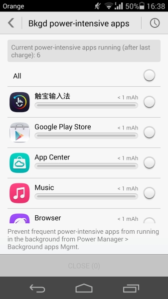
Again, similarly to the rights management settings, Huawei exposes fine-grained controls over power usage of applications. In this case it's not the performance of said apps that is limited, but their life-cycle which gets stopped whenever they get sent into the background or when the screen is off. The user is able to explicitly protect apps from being killed by the memory manager in such cases. If an unprotected application is using excessive CPU cycles in the background, a warning notification is prompted to the user and a more detailled view with a power usage estimate can be brought up for further investigation. Again, it seems that Huawei is providing counter-measures for poorly-written apps that can silently eat away at a device's battery.
Next, let's move on to the "added value" applications that are pre-installed with the phone.


59 Comments
View All Comments
semo - Friday, September 12, 2014 - link
Why no user replaceable battery? I've heard all the reasons why I shouldn't care but I still want one and wonder if planned obsolescence is the only reason for not including it.Also, is Qi an option for this phone?
Andrei Frumusanu - Friday, September 12, 2014 - link
There is no Qi charging option.semo - Friday, September 12, 2014 - link
Thanks Andrei. I think it is worthwhile pointing out this missing feature in the article just like you did with the non-removable battery. It is important for some!marcokatz - Friday, September 26, 2014 - link
Well said. Also it's important to point at that this is an Apple-wannabe that no way can match up to some of the really highly rated phones out there. /Marco from http://www.consumertop.com/best-phone-guide/Excerpt - Wednesday, October 8, 2014 - link
Yeah bro, you tell em. And Andrea why U no learn Chinese man? I wanna know what that extra stuff does. I'm going to China in like, a minute, like everyone else. What, you don't care about me bro? I love you man.And does it have haptic feed-back for goodness snakes? I want them good vibes in me fingas.
What about a sit test? Most of us reading here have fat arses, do you know sit (test)? I don't know sit (test) but I wanna hear your experience with sitting, maybe try with a heavy object like a cow, yeah a bull sit test.
That'd be great keep up the good work. <3
Murloc - Saturday, September 13, 2014 - link
1. takes up space2. makes the phone structurally weaker
2. planned obsolence/forced service you have to pay a lot for are good ways to make money
Alexey291 - Saturday, September 13, 2014 - link
Takes up literally no space seeing how Samsung S4 and S5 are both smaller and thinner than HTC One (M7 and M8 respectively)Arguably the back that's able to pop off makes the phone LESS prone to breaking as it allows the force to dissipate somewhat better than in the case of a rigid structure which simply breaks.
And lastly I am going to play the world's smallest violin for the POOR POOR manufacturers trying to make a quick buck from planned obsolescence or paid-for battery replacement.
I mean I know anandtech is all about manufacturer interests but I'll care about their concerns and problems the moment they stop earning millions upon millions in profits.
Intervenator - Saturday, September 13, 2014 - link
Are you really saying that the S4 and S5 are thinner than the HTC One because of the replaceable battery? And that it takes up "literally no space"? Really?arsjum - Saturday, September 13, 2014 - link
Not because of, in spite of.Alexey291 - Saturday, September 13, 2014 - link
Thank you sir. That's precisely what I meant. Its thinner and yet it has a replaceable battery. Impossiburu /o\To me personally all that "the replaceable battery is inefficient" nonsense is just that - nonsense. Some companies are just better at making thinner phones and some try to cut corners (and costs) at every possible stage.
And yes Anandtech has historically supported nothing but the manufacturer interests. They have been walking on these eggshells for a long time and that's precisely why they never directly criticise any dubious or greedy decision made by their sponsors :) In fact they sometimes go a step further and tell consumers (like myself) that we are wrong in wanting things like replaceable batteries and microsd slots because they are so "inefficient"
/sigh